Filipino households have always marked their serving pieces. The bandehado passed down from a lola often has her married initials burned into the underside. The wooden spoon a father brought home from a trip to Pampanga has the town name and a date carved on the handle. What changes across generations is not the impulse to mark, but the format. Some households keep to two or three initials. Others prefer the full name spelled out, sometimes with the year. Both are correct. What matters is choosing the format that will still read as intentional in twenty years, on a piece that can hold it.
This guide walks through the practical differences between monogram and full-name engraving on acacia tableware, the way the piece itself constrains the choice, and the specifically Filipino naming realities that make the textbook Western monogram formulas incomplete. It closes with a working method for choosing the format first and the piece second.
Two traditions, one wood surface
Monogram engraving and full-name engraving are not the same tradition dressed differently. They come from different social functions and they still signal different things.
The monogram tradition
The monogram is a compression device. Historically it was a mark of ownership and lineage on linens, silver, and later on printed stationery. In the American and European conventions that most Filipino households inherited through mid-century catalogues and bridal registries, the monogram is a fixed arrangement of two or three letters. A three-letter monogram traditionally reads first initial, last initial (larger, centre), middle initial. For a single person it is a personal mark. For a married couple it is a shared mark. The visual language is restrained. It suits repeat surfaces, like a set of six matching bowls, because the eye reads it once and then relaxes.
The full-name tradition
Full-name engraving comes from a different lineage. It borrows from the practice of naming a piece for its recipient, as with a christening cup, a graduation gift, or a serving board given at a wedding. Where the monogram compresses, the full name declares. It reads unmistakably as a gift, and it is unmistakably about one occasion, one person, one household. It is warmer, less formal, and more legible to guests who do not know the initials by heart. On a large surface with room to breathe, a full name feels generous. On a small surface, it crowds.
What each format signals at the table
When a guest picks up a bowl and sees a discreet three-letter mark on the underside, the signal is heritage. This is the household's pattern, applied to the household's serving pieces. When the same guest sees "The Salvador Family, 2024" burned into the rim of a serving board, the signal is occasion. This piece entered the family with a story attached. Neither reading is better. But they are different, and the decision should be made deliberately rather than defaulted into.

What the piece dictates
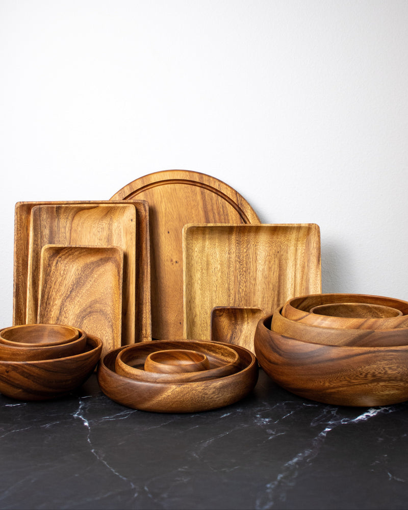
Before you decide what to say, look at where it has to sit. Acacia is a hardwood with strong, often dramatic figuring. The grain does more work on the surface than a plain oak or maple, which means the engraving has to negotiate for space with the wood itself. That negotiation is different for every form.
Curved surfaces
Bowls, serving spoons, and rounded platters have no flat panel for a mark. Engraving on a curved surface reads best in short bursts. Two or three letters, arranged tight, sit inside the curve without appearing to slide. A full name on a curved bowl exterior tends to fight the geometry. The letters near the peak read at a different angle from the letters near the edges, and the eye picks that up as a subtle wrongness. If you are marking a bowl or a spoon, default to a monogram unless the piece has a specifically flat panel for the mark.
Flat panels and rims
Serving boards, cheese boards, and the flat rims of large platters give the engraver a real canvas. A full name, a date, a short dedication, all of these read cleanly on a flat surface as long as there is enough length to keep the letter height in proportion. A rough working rule is that the engraved line should occupy no more than about sixty percent of the available length, so the mark has visual air on both sides.
Grain interference
Acacia figuring is beautiful and it is loud. Where the grain runs in tight bands, small serif fonts and thin monograms can visually break up. In those zones, chunkier sans-serif letters or a simple block monogram hold together better. Where the grain runs quiet, almost any typeface reads clean. This is why the piece has to come into the conversation early. You cannot design a mark in the abstract and then hope the wood cooperates.

Start with the mark, not the mould
Our custom engraving service works from your piece and your name to arrange the mark in the calmest section of the grain.
Shop the Custom Engraving service →A suitability matrix
Rather than argue format in the abstract, work through the matrix. For each piece you own or plan to buy, ask three questions in order. The answers narrow the format for you.
Question one: how many pieces in the set?
A single hero piece, like one large serving bowl or one long board, can carry a full name and a date. The piece is meant to be looked at and it is only marked once. A matched set of six or eight smaller pieces should carry the same mark on each. A full name repeated eight times reads busy. A monogram repeated eight times reads intentional. If the set is larger than four, default to a monogram.
Question two: who is the piece for?
A gift to a specific person or a specific couple reads more clearly with a full name or a shared surname. The gift context invites specificity. A piece the household is buying for itself, to become part of the everyday table, reads more classically with a monogram. It stops being about one moment and becomes a mark of the household as an ongoing thing.
Question three: how public is the piece?
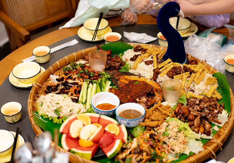
A cutting board that lives on the counter is seen mostly by the household. A serving platter that comes out for every Sunday kainan is seen by extended family and guests. The more public the piece, the more the mark is doing social work. Full names spelled out are legible to guests. Monograms require the guest to be inside the code.
A quick reference
- Small bowls, spoons, ladles, individual pieces: monogram.
- Sets of four or more matching pieces: monogram.
- Serving board or platter as a wedding, baptism, or housewarming gift: full name and date.
- Large serving bowl for a single household as an heirloom purchase: monogram or shared surname.
- Christening spoon, first-birthday piece, or graduation gift: full name.

A hero piece worth marking
The Ama bowl gives a full name and date the length and flat rim they need to read as an heirloom.
Shop the Ama Bowl →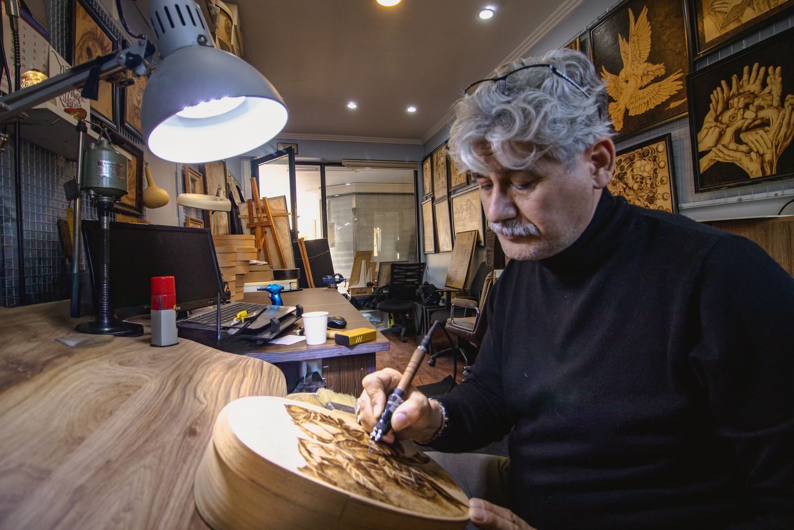
The Filipino naming reality
The classic three-letter monogram formula, first initial small, surname initial large, middle initial small, assumes a Western naming pattern where the middle name is a given name. Filipino naming does not work that way, and any guide that ignores this ends up producing marks that read wrong.
The middle name is the mother's maiden surname
In the Philippines, a person's middle name is their mother's maiden surname. So a woman named Maria Cristina Reyes Salvador has Reyes as her middle name, not because it is a second given name, but because her mother was born a Reyes. This means that the classic monogram MRS, arranged as M (small) S (large) R (small), is not just Cristina's initials. It is a compressed record of two families joining. That reading is powerful, and it is the reason many Filipino households prefer the traditional arrangement. But it also means the middle initial is doing family-tree work, not personal-name work, and if the piece is meant to celebrate the individual rather than the lineage, a two-initial personal mark might read closer to the truth.
Long compound given names
Filipino given names are frequently compound. Jose Miguel, Maria Cristina, Anna Patricia, Juan Carlos. When the person goes by a nickname derived from the compound, like Miguel, Tina, Patti, or JC, a monogram built from the compound initials sometimes reads like a stranger. Ask what the person actually writes on documents versus what they answer to. For gifts, use the initials that match how the recipient thinks of themselves.
Prefixes and particles
Surnames with Spanish-derived particles, like de la Cruz, de los Santos, del Rosario, do not translate neatly to a single initial. A traditional monogram treats the operative surname as the initial, so de la Cruz becomes C, not D. The particle is understood but not represented. For full-name engraving there is no such compression problem, and the full name reads correctly. This is one of the cases where a full name genuinely serves the recipient better than a monogram.
Married couples and shared surnames
The Western couple's monogram tradition places the shared surname initial in the large centre position, with the bride's given-name initial on the left and the groom's on the right. In Filipino practice, particularly for couples who keep both surnames, this convention needs a decision. Options include arranging the two surname initials side by side, using only the husband's surname if the wife has taken it, or spelling out both surnames in full. None of these is more traditional than another in the Filipino context. What matters is that the couple agrees on the arrangement before the mark is made, because the arrangement cannot be quietly reversed later.
Placement, orientation, and depth
Once the format is chosen, three physical decisions remain. Each of them affects how the mark ages and how it presents.
Placement
On serving boards, the mark traditionally sits at one short end, offset from centre by a small margin. This keeps the working surface of the board clear for cutting and plating. On rimmed platters, the mark sits at the rim in the position furthest from the person carrying it. On bowls, the mark sits on the exterior underside near the foot, or on the interior at the base if the bowl is shallow enough for the mark to remain visible when the piece is in use. On serving spoons and ladles, the mark sits on the back of the handle near the neck.
Orientation
Marks read best when they are oriented for the person who uses the piece, not the person who receives it as a gift. This sounds obvious and it is regularly forgotten. A serving board that reads correctly when the recipient opens the box, held vertically, may read upside down when the board is in use on the counter. Confirm the orientation with the engraver before the piece is cut. The Gorosin bowl set and other stackable pieces present a related orientation question, since a mark on the exterior needs to be positioned consistently across all bowls in the stack.
Depth
Deeper engraving lasts longer through years of hand washing and oiling. It also collects more oil, which darkens the mark over time and gives it the aged patina that older engraved pieces develop naturally. Shallower engraving reads more delicate at first and holds its original crispness longer, but it fades faster if the piece is washed aggressively. For an heirloom piece, err deeper. For a decorative accent piece, err shallower. Deep engraving on acacia typically retains legibility across decades of normal household use, based on the way traditional carved bandehado from mid-century households still read today.

A set worth marking together
The Gorosin bowl set is designed to carry a consistent monogram across matching pieces without crowding the grain.
Shop the Gorosin Bowl Set →Buying backward from the format
The most common mistake households make with engraved tableware is to buy the piece first and then try to fit a mark onto it. The mark ends up too small, or crowded by grain, or in an awkward position because the piece was not designed with engraving in mind. The better sequence is the reverse.
Start with the words
Write out, in full, exactly what you want on the piece. Full name with year. Or two initials. Or the family surname. Whatever the mark is going to say, write it down first as text. This is the moment to make the format decision, before any piece is chosen.
Measure the mark
Estimate the length of the mark at a legible letter height. As a rough guide, a full name at readable size on a serving board wants about eight to twelve centimetres of clear flat length. A three-letter monogram wants about three to five centimetres square. A single initial wants about two to three centimetres.
Choose the piece that fits
Now select the piece. A cheese board with a plain flat rim of the right length. A bowl with a calm exterior panel. A platter with a wide unengraved zone. If you are ordering an Ina plate set or another matched grouping, confirm that the engraving position sits on the calmest section of grain across all pieces, not just the top one in the stack.
Confirm with the engraver
Before the mark is cut, get a proof or a placement mockup. Confirm three things: the exact spelling, the orientation, and the depth. Spelling errors on wood are not repairable. Reversed orientation cannot be politely ignored. Depth is the one variable that can be adjusted at the moment of cutting, so decide it consciously rather than accepting the default.
Households that follow this sequence end up with marked pieces that read as considered rather than added-on. The mark and the piece belong to each other. That is what makes an engraved piece feel like an heirloom in the first place.
Frequently Asked Questions
Is a monogram always three letters?
No. Two-letter and single-letter monograms are equally traditional. Two letters usually pair a given-name initial with a surname initial. A single initial is often a household mark, used on shared serving pieces. Three letters carries the most social history but is not required.
In a couple's monogram, whose initial goes first?
There is no single Filipino convention. The traditional Western arrangement places the wife's given initial on the left, the shared surname initial larger in the centre, and the husband's given initial on the right. Filipino couples who keep both surnames often prefer arrangements that give equal weight to both family names. Agree on the order before ordering, because it cannot be quietly changed later.
Does engraving weaken the wood?
Not at any depth used for household tableware. Standard engraving removes a fraction of a millimetre of surface material and does not affect the structural integrity of the piece. The mark can be washed, oiled, and used in normal service without special handling.
Can an engraved acacia piece go through a dishwasher?
No, and this is the same rule for any acacia piece, engraved or not. Hand wash with mild soap, dry immediately, and re-oil periodically. Engraved marks collect oil during re-oiling, which is what gives older marked pieces their darker, aged patina.
How long is too long for a name on a serving board?
A working ceiling is about twenty-five characters including spaces, on a board with a flat length of at least thirty-five centimetres. Longer than that and the letters either become too small to read from across the table or force a two-line layout that fights the horizontal geometry of the board.
Should I include a date with a full name?
For gift pieces marking a specific occasion, yes. The year alone is usually enough, and it dates the piece for future generations without over-specifying the moment. Full dates are best reserved for pieces commemorating one particular event, like a wedding or baptism.